Undeniably, a single-page website, as suggested by the name, embodies compactness. It contains no internal links guiding users to additional pages. Everything is neatly organized and directly accessible within a singular environment. However, this shouldn’t lead to the misconception that single-page web designs confine users. Far from it.
In fact, single-page websites, when designed creatively, can create an expansive user experience. With the right integration of interactions, animations, horizontal scrolling, transitions, and other visually engaging elements, these websites can transcend the visual and functional limits of a solitary page. The overall impression can be akin to a rich, evolving canvas, making the user experience feel exponentially larger than it factually is.
To demonstrate the true potential and creative versatility of single-page websites, we’ve compiled a detailed guide packed with practical tips and examples. Through this, we hope to demonstrate that the power of design and user experience can indeed be contained in small, smart packages.
What are the Ideal Candidates for Single-Page Website Design?
In the realm of digital experiences, a single-page website can serve a multitude of purposes. Its simplified structure and focus on concise storytelling make it the perfect candidate for several types of content. As the trend towards minimalistic digital experiences intensify, single-page websites are experiencing a resurgence. Here are some domains where they’ve truly excelled:
- Creative portfolios: Single-page websites offer a creative playground for artists, photographers, and designers to exhibit their work. The uninterrupted linear narrative brings focus to the creator’s journey, providing an immersive tour of their artistic evolution;
- Design studio sites: Design studios can leverage the single-page layout to showcase their design philosophy, expertise, and previous work. A masterfully designed single-page website speaks louder than words about a studio’s design capabilities;
- Landing pages: They require a focused message and a clear call-to-action – both achievable with a compelling one-page design;
- Event websites: These require timely information delivery with immediate impact—qualities that align well with single-page design. Concerts, conferences, or festivals can benefit from this format;
- Product pages: When introducing a unique product, a single-page layout can provide a focused presentation. It can carry customers along an engaging journey, from highlighting product features to pushing towards the purchase;
- Agency websites: Creative, digital, and marketing agencies can use single-page designs to demonstrate their services, work, and client testimonials without overwhelming visitors with navigation choices;
- Tech startups: They can utilize single-page websites to introduce their solutions, explain their unique selling proposition, and convert visitors into customers or investors.
However, these examples are not exhaustive. Single-page websites are versatile tools, limited only by creativity. They are a dynamic platform for individuals and businesses to convey their message in a focused, engaging manner.
A Showcase of Single-Page Websites: 10 Stellar Examples
Single-page websites are increasingly seen as a potent way to succinctly deliver key messages to audiences. Let’s delve into ten different single-page website designs that use visual and interactive elements effectively to maximize their limited space.
Gerard Stric’s Portfolio
Our first showcase puts the spotlight on portfolio websites. This site belongs to Gerard Stric, who has chosen to represent his work and skills through a single-page design. His portfolio, created using Vev, is a clean, well-structured presentation featuring subtle scroll-triggered animations and hover effects. Instead of overloading his featured projects with information, Stric has linked them to their respective Figma files, allowing a detailed exploration of his work methodology.

Morpho: The Tech Company
For Morpho, a tech company, their single-page website is a visual narrative. An opening animation of a caterpillar’s metamorphosis into a butterfly sets the tone, followed by a series of screens connected by a thread-like line symbolizing transformation. The design employs visual diversity through vertical and horizontal scrolling, detailed illustrations, and parallax effects, creating an endlessly engaging visual journey.

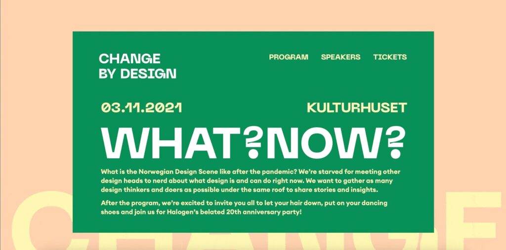
Change By Design: The Event
When advertising events like conferences or festivals, single-page designs can be very effective. The Change by Design event in Norway adopts this approach, using a single-page website to detail speakers, programs, and schedules. The design uses scroll-triggered transitions and content blocks that scroll over fixed backgrounds, creating an immersive, easy-to-navigate experience.
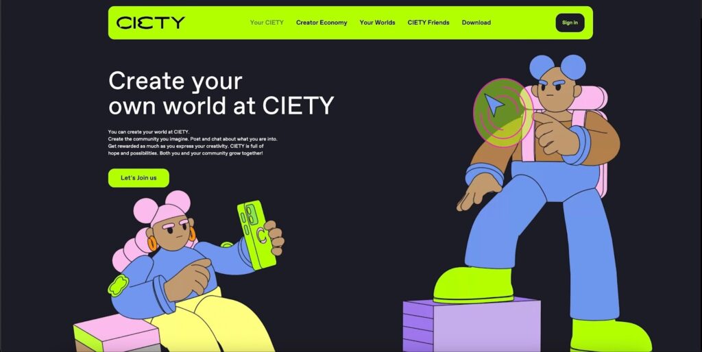
Ciety: A Visual Delight
This single-page website by Ciety proves how expansive a single page can feel. Rich with color, parallax effects, animated transitions, and interactivity, it reveals new engaging content with every scroll, transforming a one-page scroll into an exciting exploration.
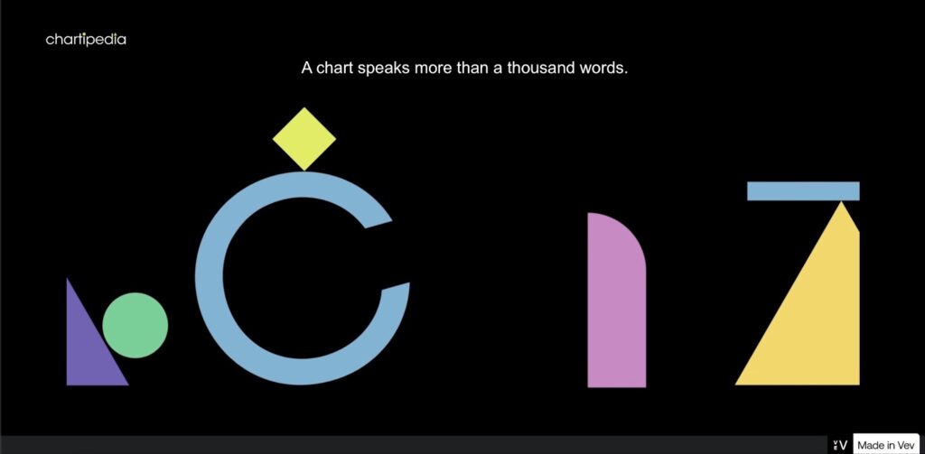
Chartipedia: Crafting Data Into Visuals
Our last showcase is Chartipedia, a company committed to converting data into compelling visuals. Their single-page website, designed with Vev, showcases their skillset through various interactive elements and animations. The dark gray background contrasts well with vibrant color splashes and sleek animations, demonstrating the company’s prowess in merging artistry with data.
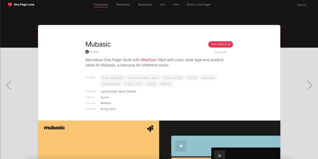
Mubasic: A Musical Wonderland
For projects requiring child-friendly music, Mubasic provides a charming array of creator-made options. When you land on Mubasic’s single-page site, you are greeted with colorful piano keys, each triggering a unique sound. Not only is this a delightful experience, but it also perfectly captures the brand’s youthful, playful identity.
The user interface (UI) elements throughout the design are large and intuitive, simplifying interaction. The quirky icons, bright colors, and fuss-free access to Mubasic’s sound examples make the experience both fun and informative.
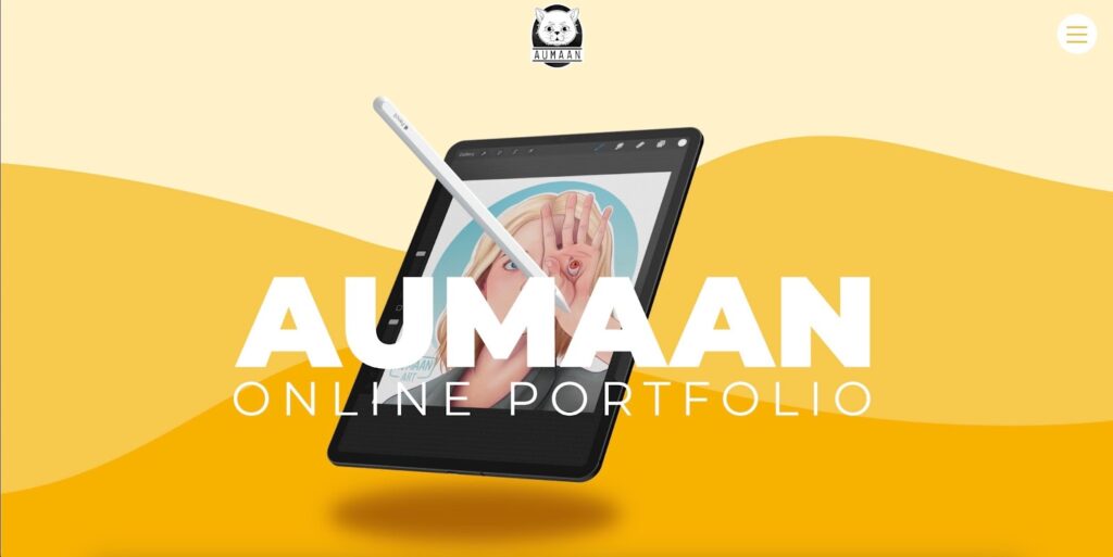
Aumaan Art: Illuminating Creativity
Aumaan Art, an avatar of Vev’s Customer Success Manager, Lewis, is a single-page website example that beautifully showcases his illustrations. Despite the constraints of a one-page design, the site captivates with its enormous creativity, subtle animations, and striking design. Visitors can swiftly browse the gallery of illustrations, and a clean contact block is conveniently placed right below.
Salt Studio: Unconventional Elegance
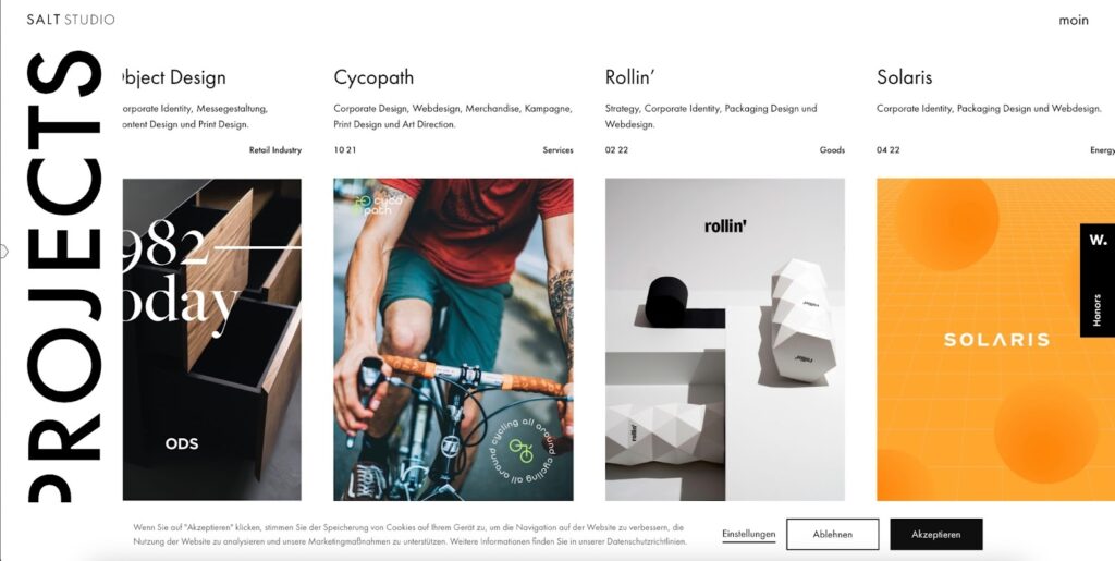
Salt Studio’s single-page website brilliantly blends eclecticism with minimalism. From the quirky cursor design to the innovative gallery, Salt Studio’s creative touch is evident throughout. By incorporating horizontal scrolling, they make their website feel expansive, managing to maintain an open, uncluttered design while fitting in plenty of content.
Viita: Layered Brilliance
Viita Watches’ single-page site captivates visitors with layered visuals, animated elements, and bold typography. For example, they use an interactive timeline to present their product’s evolution, allowing visitors to engage while consuming a large amount of information contained within a compact space.

Fictional Typeface: A Showcase of Quirks
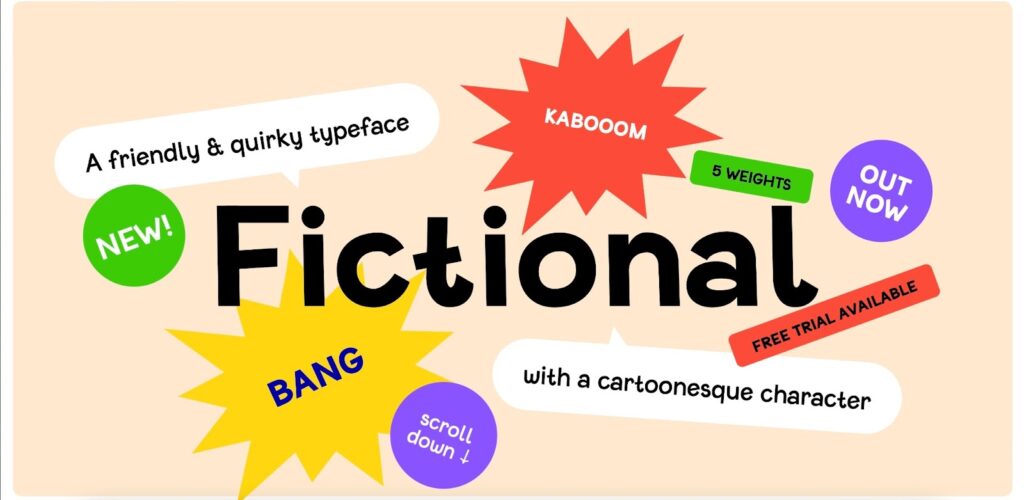
A single-page design is an excellent choice for launching a product, as demonstrated by Fictional Typeface. Described as “a friendly and quirky typeface,” their design echoes this sentiment with oversized cursors and a vibrant color scheme. Instead of traditional, static text strings, Fictional Typeface displays its characters in an interactive table, encouraging users to click through and explore the unique letterforms.
Conclusion
Single-page websites are redefining the boundaries of digital storytelling, proving that sometimes, less is indeed more. They epitomize efficiency, creativity, and user-centric design – elements that are crucial in today’s digital age. The simplicity and ease of navigation they offer, coupled with their potential for innovative design, make single-page websites an exciting avenue for businesses and individuals alike to effectively communicate their narrative, engage their audience, and leave a lasting impression.

